SUGARBUN


From humble beginnings as an ice cream parlor in 1979, SugarBun has evolved to become one of the leading and most innovative Quick Service Restaurants, Cafes and Destination Centers in Malaysia and Negara Brunei Darussalam.
Future expansion programmes will see SugarBun establishing outlets in other foreign markets as part of its efforts to become a global brand.
Starting of with broasted chicken as its main seller, SugarBun has progressed beyond chicken and hamburgers to become the first Quick Service Restaurant with the “4-in-1” and Destination Centres Concept offering mouth watering Asian Cuisine, Patisseries, Café Bar Beverages and Western Cuisine catering to a great variety of taste.
I choose Sugarbun for my rebranding project because in Sabah and Sarawak, this
restaurant is actually quite famous but in Peninsular Malaysia, Sugarbun are not well known at all. As a regular customer at Sugarbun, I want to help this restaurant to grow bigger all around Malaysia for their delicious food.
LOGO
First of all, I started with the logo first, my idea for this logo was 100% typelogo. So as usual,
I sketch several types of logos, 80% of a logo are from your pencil and paper.

And then, I vectorized this logo in Ai with Pen Tool only.


LOGO VARIETIES
After finishing the vectorization, I tweak the type until it looks perfect and then modify the logo to multiple kind of style.


With all of those, I had to choose the most suitable logo and
I chose this one.

THEME
For the whole project, I had to redesign the theme and the styles to suit the logo the
overall theme for the restaurant.


Why does all fast food chains have red color in their logo/brand ?
Red is known as the color that piques human desire in many cultures. Red has been used to describe the desire for war, love, lust, and life. But just which shade to use can get pretty complex for corporations or people willing to pay top dollar to evoke responses in others.
According to color theory, "warm" colors like red and yellow are more stimulating than "cool" ones like blue and green. Some also say that red and yellow stimulate the appetite.
Red and yellow are said to be the best colors associated with hunger and appetite.They make people feel hungry and induce cravings
Red can catches more attention than other colours.Of course ,yellow can do so .but it is difficult to control .
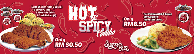
MOCK UP


ADVERSTISEMENT


THANKYOU.

No comments:
Post a Comment